I recently asked for feedback on three potential covers for my upcoming book “The AI-Powered Thought Leader”. I received 57 responses in 24 hours. I used AI to collate and analyze the data, highlighting key insights and contradictions in the feedback. This post is Part 1, where I outline the cover options, feedback, and show the analysis.
Table of Contents
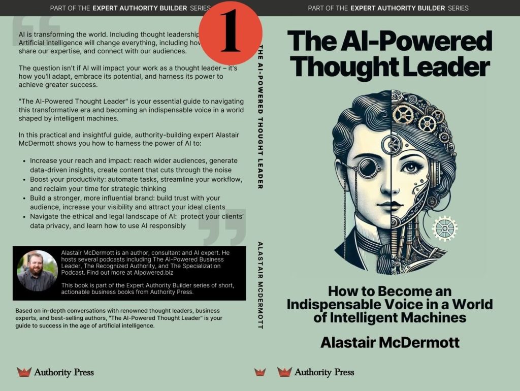
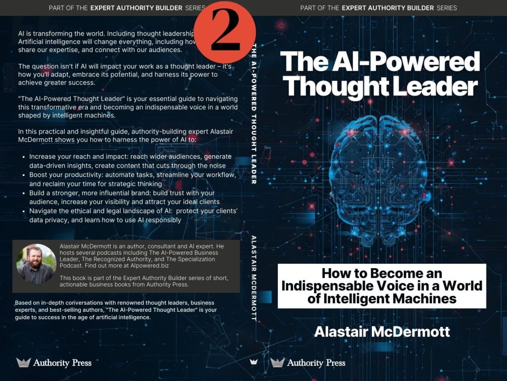
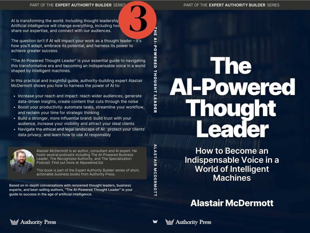
Here are the cover options:
If you want to share your opinion on these, please leave a comment on this LinkedIn post.
How I Analyzed It
I used ChatGPT and Claude to process and analyze the feedback. This not only demonstrated AI in action, but also saved time.
Quantitative Results
Here’s the voting breakdown:
- Cover 1: 30 votes (52.6%)
- Cover 2: 9 votes (15.8%)
- Cover 3: 16 votes (28.1%)
- Undecided: 2 votes (3.5%)
Winner: Cover 1 was the clear favorite, getting over half the votes.
Qualitative Analysis
Cover 1: The Front Runner
Strengths:
- Unique and eye-catching design
- Good blend of human and machine elements
- Distinctive colour scheme
Criticisms:
- Some saw it as “steampunk” or “dystopic”
- Colour wasn’t seen as authoritative
- Concerns about clutter and gender representation
Contrasting Opinions
One respondent praised its uniqueness: “The green. It’s different. Feels art deco bioshock instead of what everyone else is doing.”
Another criticized: “Don’t like No 1 – too much detail and too gray color.”
Cover 2: The Least Favored Option
Strengths:
- Modern and high-tech look
- Clear AI representation
Criticisms:
- Seen as generic or stock imagery
- Looked overly technical
- Distracting design elements, especially the white banner
Notable Feedback: One respondent thought the brain imagery suggested “brain implant,” which could be misinterpreted.
Cover 3: The Minimalist Approach
Strengths:
- Clean, professional look
- Emphasizes the instructional nature of the book
Criticisms:
- Lacks visual interest
- Might blend in with other books
Contrasting Opinions: Some praised its simplicity and authoritative look, while others found it bland. One respondent called Cover 3 a “yawn,” saying it “doesn’t tell me anything you’re making me do all the work.”
Key Insights and Implications
- Colour Psychology: The green of Cover 1 sparked debate. Some liked its uniqueness, others questioned if it suited the subject. Colour is crucial in conveying the book’s tone and content.
- Design Elements and Misinterpretation: Feedback on Cover 2’s brain imagery suggested “brain implants,” showing the risk of misinterpretation. Clear, unambiguous design is essential in scientific or technical books.
- Balancing Uniqueness and Professionalism: Reactions to Cover 1 and Cover 3 show the challenge of creating a design that’s both eye-catching and professional. There might be a trade-off between standing out and looking serious and authoritative.
- Market Differentiation: Several respondents noted Covers 2 and 3 looked similar to existing AI book designs. Differentiation is important in a crowded market.
- Audience Segmentation: The varied responses suggest different preferences among audience segments. Further analysis could reveal if these preferences correlate with professional background, age, or other factors.
Next Steps
While Cover 1 was the favorite, the qualitative feedback shows complexities worth considering. The strong but divided opinions suggest Cover 1 could stand out in the market but might also alienate some of the target audience.
Here’s what I’ll do next:
- Consider variations of Cover 1 to address concerns about colour and clarity.
- Try to combine the professionalism of Cover 3 with a more visually striking design.
- Conduct a second round of feedback with a smaller focus group, presenting refined designs.
This process shows the subjective nature of design appreciation and the challenge of creating a cover that appeals to a diverse audience while accurately representing the book’s content.
The insights gained will guide the final cover decision and inform the book’s marketing strategy.
I’ll follow-up with Part 2 on how I actually did the analysis with ChatGPT and Claude.


